Imagineer Technology Group
Global Search Filtering - HTML, CSS, React
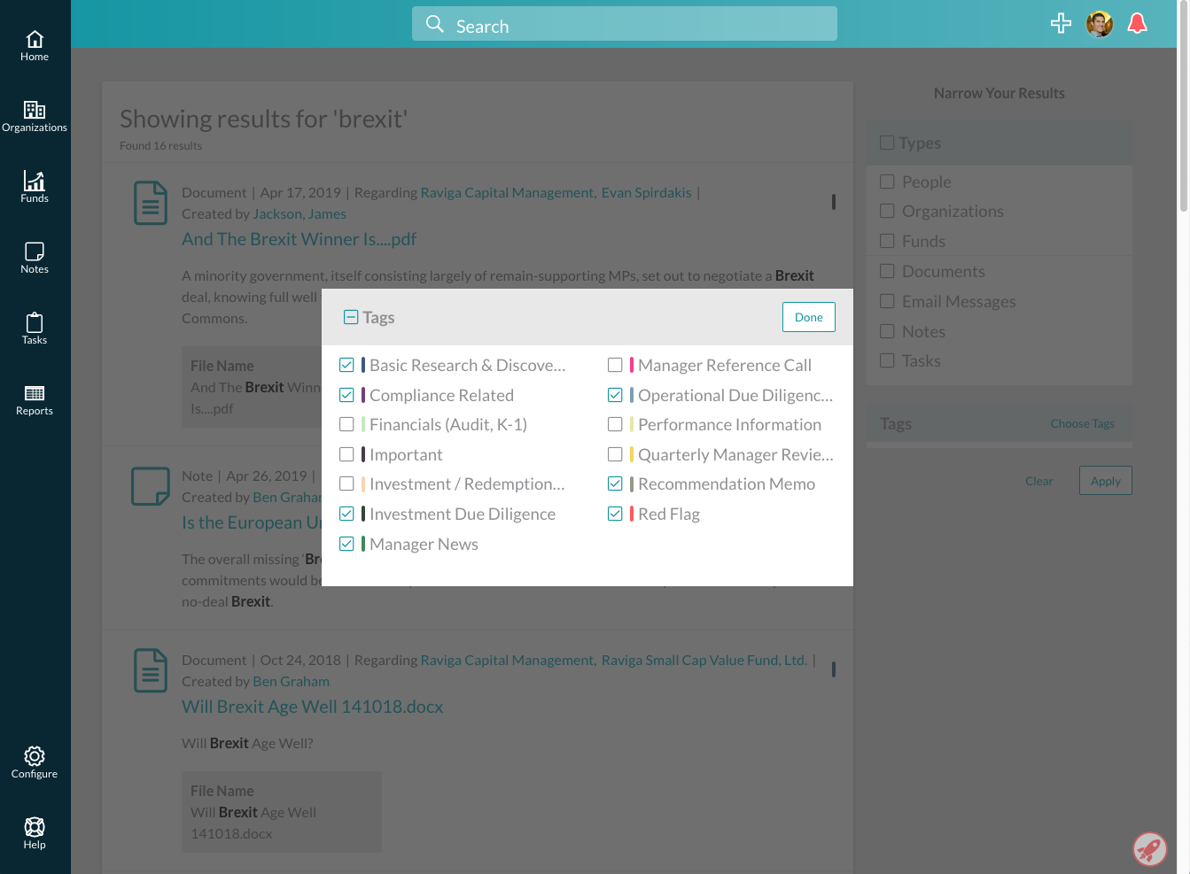
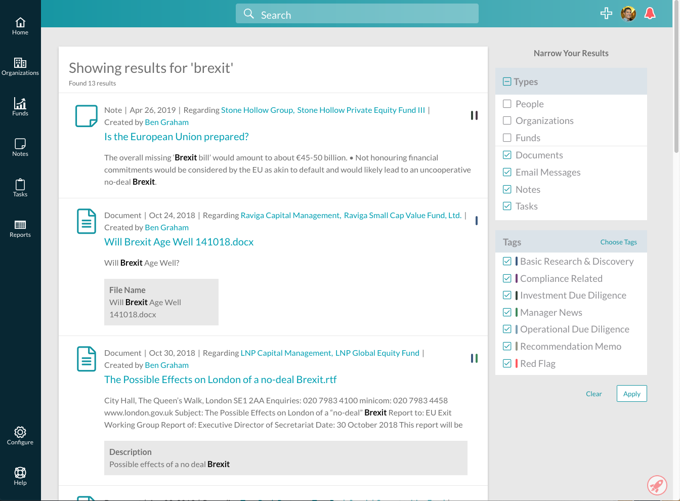
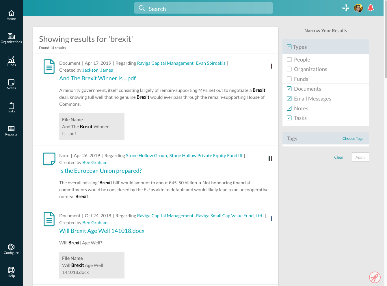
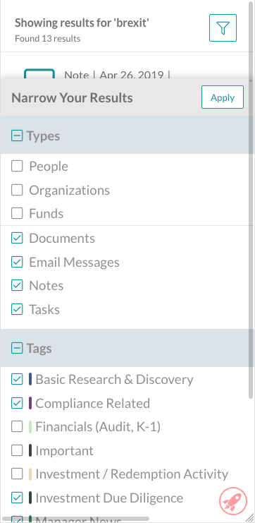
Clients requested the ability to filter our search page to only return specific types of results, or results with user-entered tags. I was responsible for implementing the entire user interface for this feature.
The biggest challenge was creating an intuitive design -- I found some of the expected behavior of the initial designs confusing once I started implementing them, so I worked with our product design team to iron out some of the wrinkles. After some back and forth on how best to display the types of results that could be displayed and how to present potentially dozens of available tags to the user, we settled on the final design collaboratively.
I also found the technical challenge of presenting tags interesting. In order to avoid overwhelming the user, we created a separate modal with all tags available to filter on; once some tags have been selected, they appear on the main search page. Moving data from component to component was a fun challenge.
As part of this project, I created nicely styled checkboxes and 3-state checkboxes for checking/unchecking an entire group of checkboxes.
Screenshots
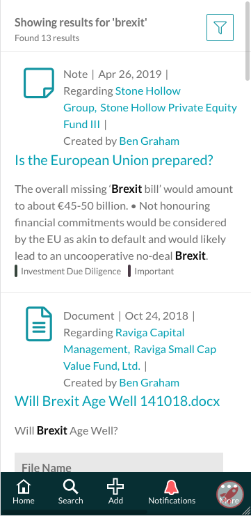
Global Search Mobile View - HTML, CSS, React
In addition to filtering on desktop, we implemented mobile-specific filtering and design around the search page.
Instead of a sidebar with filtering options, I implemented an action sheet. This element and the button controlling it are both hidden in desktop view, and only displayed on small screen sizes. I worked with design on how to display tags without needing a modal.
One of the biggest challenges was adjusting the the layout of search results. A teammate and I used CSS Grid to lay out elements of each result, which let us easily adjust how information is displayed in desktop versus mobile views.
Screenshots
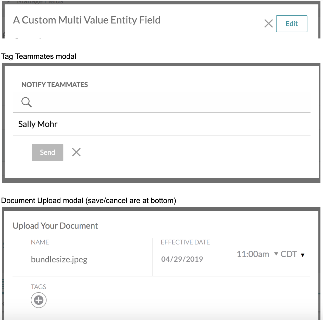
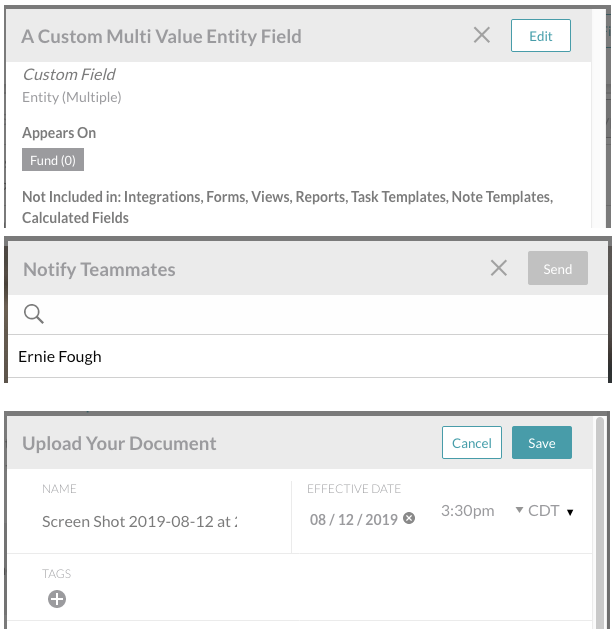
Modal Style Unification - HTML, CSS, React
Before I started on this project, modal implementation was somewhat scattershot -- some modals had headers and some didn't, some modals had buttons at the top and some had buttons at the bottom, and so on. After I implemented the new tag modal design, I went through the app to update all modals to a single unified style.
The biggest challenge here was actually around pulling out existing styles -- our modal had originally been a Foundation modal with some built-in styling. Several of the modals in the app had a lot of brittle styling designed to override the existing modal styles. I removed as much styling as I could from the base modal, adding component-specific CSS as needed.
I also created a new ModalHeader component that put buttons and other functionality into the modal header. This gave us a consistent style and functionality for all our modals, allowing easier maintenance and unified user experience.
Screenshots
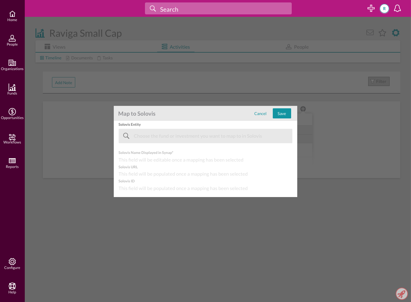
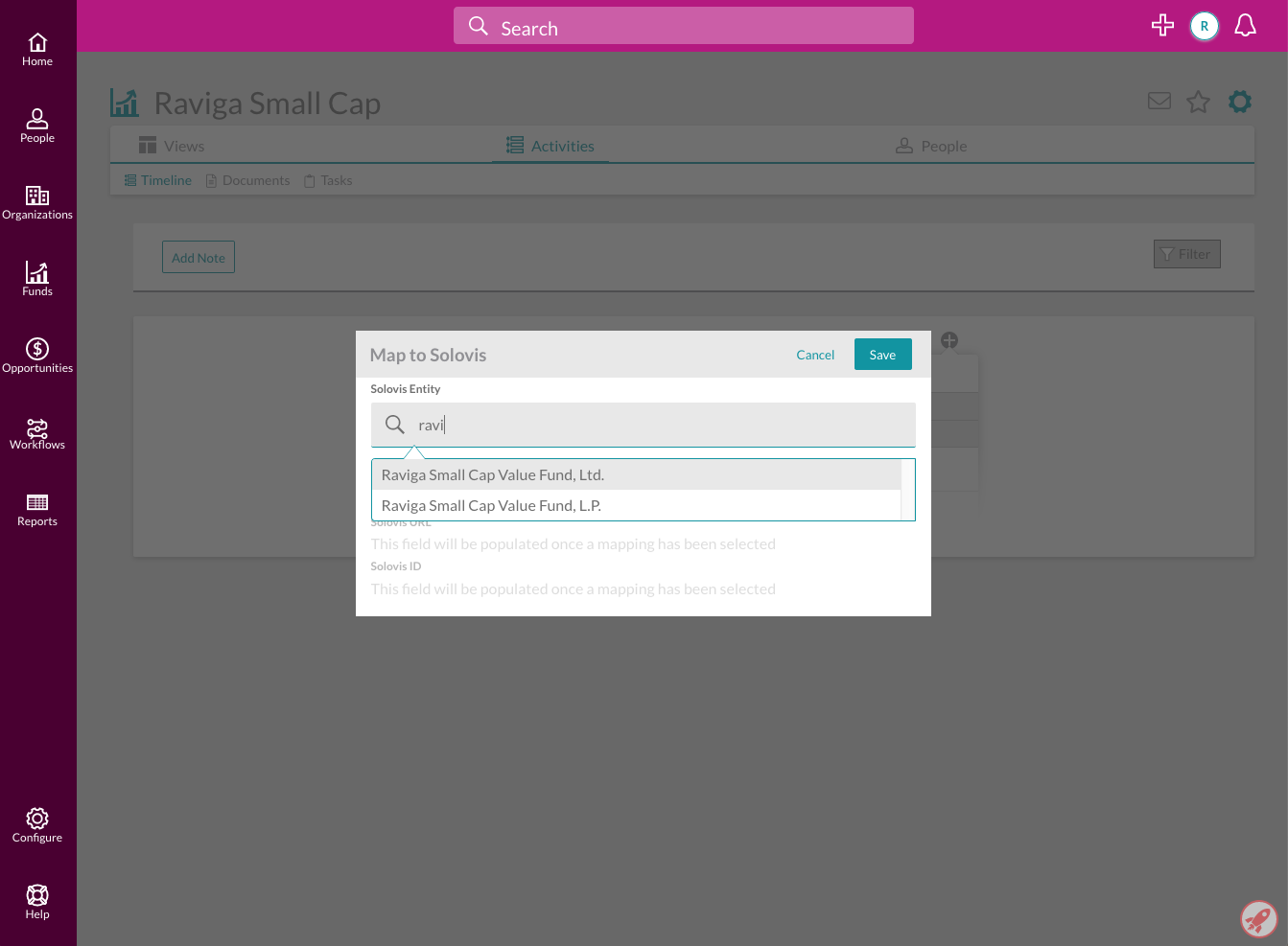
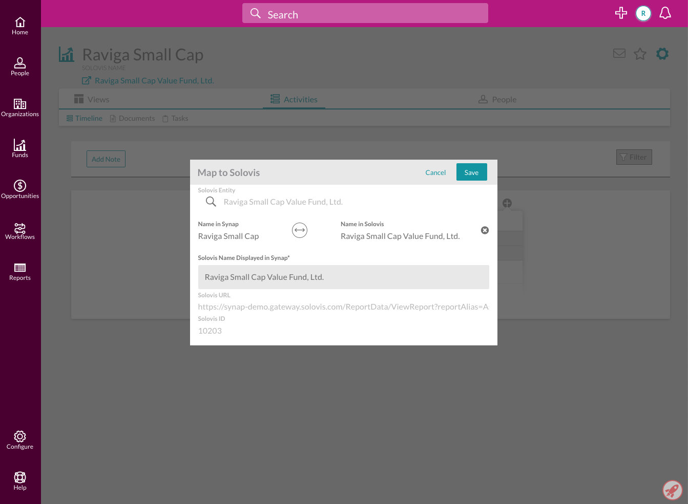
Entity Mapping Modal - Ruby on Rails, HTML, CSS, React
The application features integrations with 3rd party data; one of the main integrations is with Solovis, an institutional investment management program. Prior to the addition of this feature, mapping entities to Solovis had to be done by a member of the team and could not be done independently by users of the app.
A teammate and I worked together to create the necessary internal API endpoints, update an API client used to communicate with the Solovis API, and implement a mapping modal on the front end. Major challenges included figuring out what information was and was not available in the Solovis API, working out some implementation details around around the user interface, and handling hand-offs of the project between two different people.
One of the meatier technical challenges was around creating a text input that filtered a dropdown list of existing entities in Solovis that were available for mapping. I had to get clever with using tabindex along with mouse down events to group the dropdown with the text box, allowing them to be treated as a single distinct component with unified focus and blur behavior instead of two completely separate elements.
Screenshots
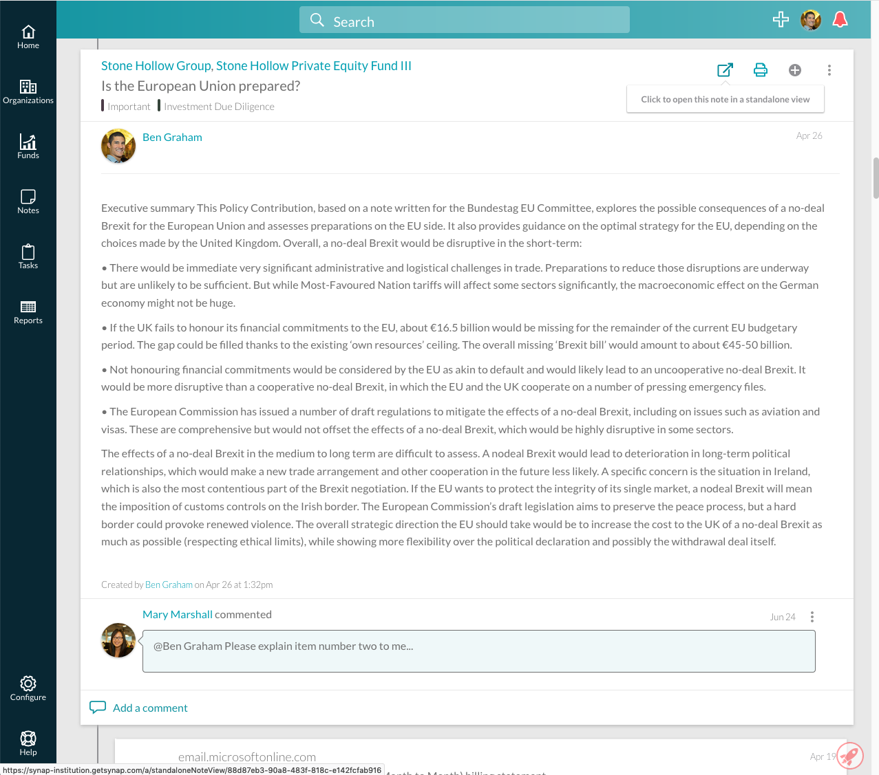
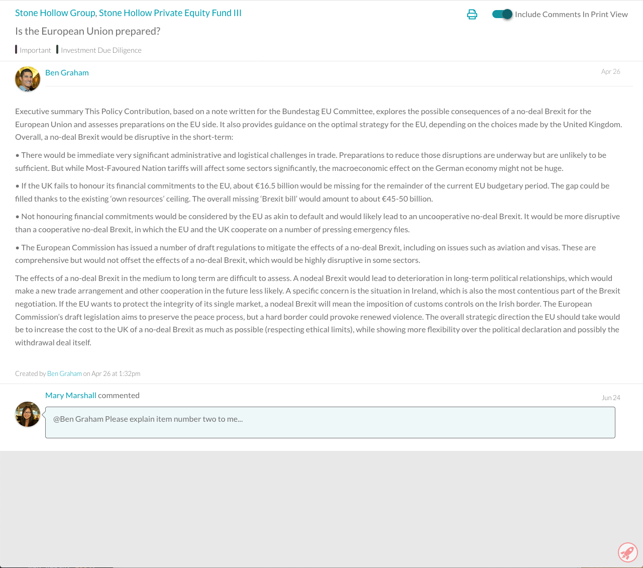
Standalone Note View - HTML, CSS, React
Clients requested a print-specific view of notes. Prior to this feature, users needed to either screencap notes in the application, which would be inconvenient for longer notes and would include visually distracting design elements; or copy and paste information from the application to a printable document, which would not be formatted correctly and could potentially not have all the information the user needed.
I created a separate section of the application solely for print views, removing unnecessary features of the main app. I only implemented design elements and information necessary to display the note, while also still including useful features, like the ability to follow links to other parts of the app.
I also added functionality to hide the comments associated with a note as needed.
Screenshots